Sorry this is late everybody, university deadlines and a new job have been taking priority lately. So here it is, a week late, but worth the wait; full of juicy self promotion!
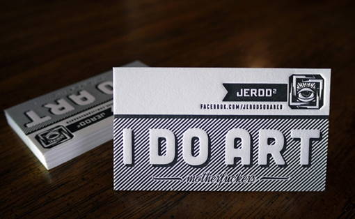
I stumbled across this business card whilst on pinterest. It belongs to Jerod Squared and was designed and printed by ‘Print and Grain’.
The world is full of competition: competition for jobs, competition for clients and competition for attention. All this competition creates a need for immediacy when it comes to self promotion. The business card needs to grab attention very quickly.
Jerod’s business card addresses this perfectly by boldly stating ‘I do art.’ Although it’s not obvious what he does specifically straight away, we do get a broader idea of his field of work, allowing the viewer to decide in an instant if his field of work is relevant to their needs.
I am a big fan of typography which also explains why I’m drawn to these cards. The card is only as successful as it is because of the bold, clean-cut type, supported by simple line backgrounds and the use of letterpress in the production.

Jerod’s business card is proof of what you can achieve when you simplify and really cut back on in-your-face images, and focus on the typography instead. This is definitely an approach I’d love to try!
